Storybook
Storybook is an open source tool that allows users to build frontend components and pages in isolation.
Leveraging Storybook makes the development and review process for adding or modifying components easier and faster while also providing a convenient place for Clutch developers to reference when building out different frontend features.
If you're interested in learning more about Storybook be sure to read their introduction guide.
Using Clutch's Storybook
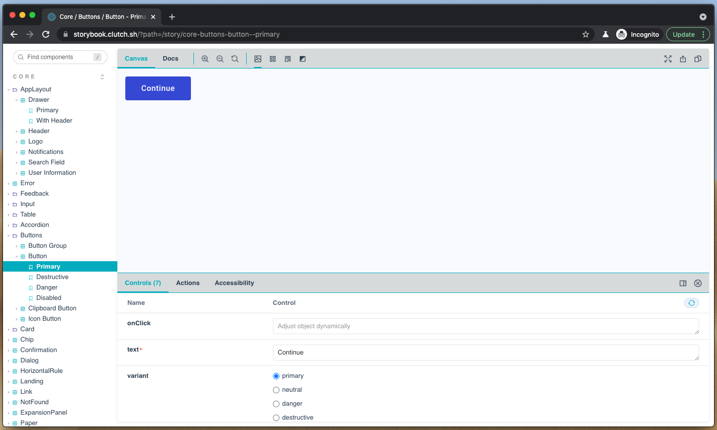
All available Clutch components can be found on Clutch's Storybook site. This site is automatically published on merges to main and should always be up to date.
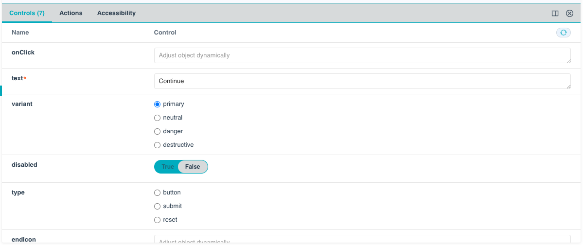
Controls
Each component within storybook exposes it's properties that can be controlled (if any) in a controls tab. This allows for developers to input custom values and see how a component will render.
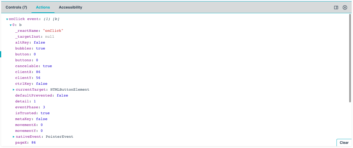
Actions
Components with some form of action (such as Button) will emit a log message within the actions tab when the action is invoked. This log message will show both the property name that registered the event notification as well as any parameters passed back by the component.
Documentation
Clutch leverages a Storybook addon to automatically generate documentation pages for every component.
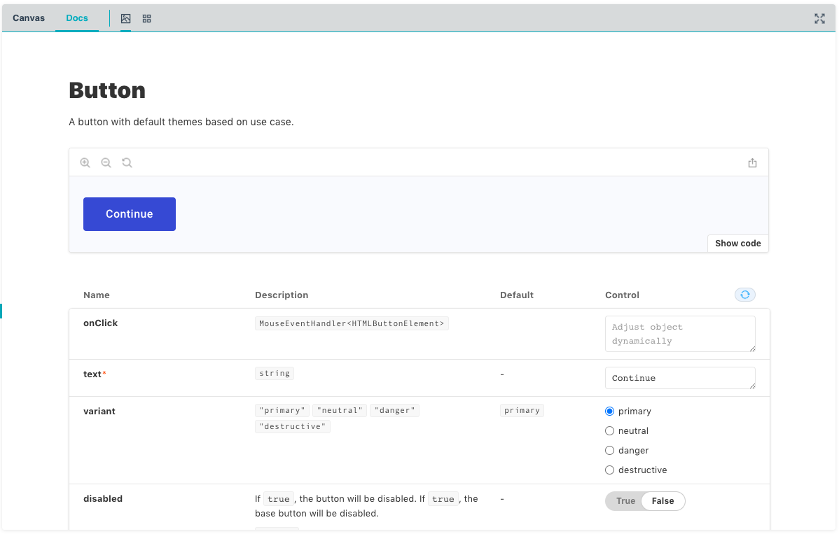
This page is generated from docstrings and props within the source code of the component and therefore should always be up to date.
At the top of the page, under the component name, is an overview of the selected component, which has been generated by parsing the component's docstring.
/**
 * A button with default themes based on use case.
 */
const Button: React.FC<ButtonProps> = ({ text, variant = "primary", ...props }) => {
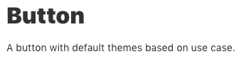
Following the overview is a rendering of the component using the current prop values, along with a button to show the code that generates this rendering.
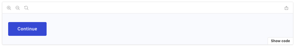
An easy way to use a Clutch component is to enter values for the component's properties that you would like to use and leverage the documentation to generate the source code for your desired component. This snippet of code can be copy and pasted into your own application to produce the same component.
Below the rendering is a list of all properites available on the component, each accompanied by a brief description, a default value if any, and the ability to modify the value.
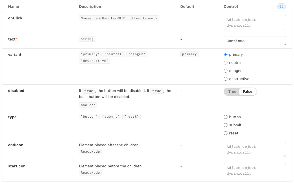
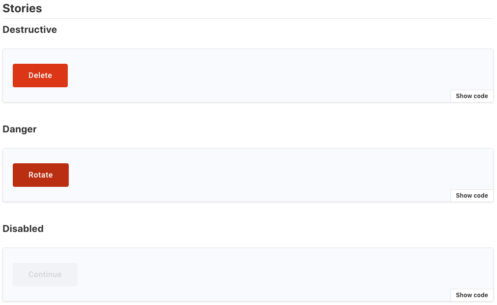
Finally, any additional stories for this component are rendered below the props. In Clutch we use these additional stories to demonstrate modifying key pieces of the component. In the Button component you can see that we have stories to highlight the button variants.
Creating Stories
Under the hood Storybook works by aggregating "stories" within a codebase and, depending on their specified location, renders them into the relevant groupings.
What's a Story?
A story is a short snippet of code that demonstrates how a specific frontend component with the specified properties will be rendered. Each frontend component should have at least one corresponding story but can have as many as needed to demonstrate all the "interesting" states a component can be in. Interesting is intentionally open ended but within Clutch we tend to add a story for the various states or variants a component can be in or have.
Structure
Clutch's Storybook is currently split by packages. At the moment it only contains components exported by @clutch-sh/core.
When adding a Storybook file it should be placed within a stories directory that lives alongside the source code of that story and have the format {component}.stories.tsx. This format is important as it allows Storybook to discover the stories within that file.
Writing Stories
All new components should be accompanied by stories. As mentioned earlier this makes reviewing the new component and any future changes easier for the team and enhances the developer experience within Clutch.
Every story follows the same format:
It has a default export containing a title, component, and any optional properties such as argument types.
export default {
  title: "Core/Buttons/Button",
  component: Button,
  argTypes: {
    onClick: { action: "onClick event" },
  },
} as Meta;
In the above example for the button component stories the title is set to
Core/Buttons/Button, which becomes the path to these stories within the Storybook component tree.Buttonis specified as the component and an optional type for argument types (argTypes) is passed to specify the value for the button'sonClickproperty. In this case theonClickprop is given a special callback type to allow Storybook to route these events to the actions tab.It has a Template to use for the component.
const Template = (props: ButtonProps) => <Button {...props} />;Continuing with the button example, the template above takes in
ButtonProps, which have been exported from the component file, and renders aButtoncomponent passing in any specified props.It has at least a primary story.
export const Primary = Template.bind({});
Primary.args = {
  text: "Continue",
};
The primary story for button is to use all the default props and provide only those that are required. In this example we set the button's text to "Continue".
When writing stories you can run Clutch's Storybook locally and test out changes. Additionally, every pull request with changes to any component file, storybook file, or dependency versions will build a preview of the Storybook site and publish a link as a status on the pull request.
Additional general information on writing stories can be found on Storybook's website.
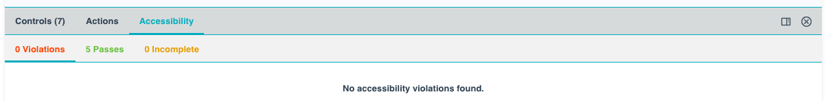
Accessibility
Clutch's Storybook leverages the a11y addon to analyze each component and make a determination if it is compliant with accessibility standards. This is particularly helpful when developing components as it provides an easy way to ensure your changes are compliant by running Storybook locally.