Great Design is Transparent

Design is one of those things that is tricky but imperative to get right. While this may seem obvious, creating and implementing a great design is much harder than you might think.
Why is design hard? Design is something that you usually start with when building a project. It is akin to blueprints of a house, determining not only what you will end up building but also the finishing details. This alone is not a problem; design is highly opinionated and there is no way to concretely say that a particular design is “correct”, especially so early on in a project. However, there is a group who can determine what the “right” design is for your product and they are your audience. Ideally you would provide various designs for them to interact with, collect feedback, and choose the best of the options but again this is difficult to do early on.
Without being able to experiment and iterate, most of the design decisions are largely guesses as to what would work best for your audience and these will likely get your product to a place where the design is “good”. This isn’t bad, a good design is something to be proud of. Users will engage with your product and recognize the thought put into the various pieces and interactions. However, an even better experience to strive for would be a design that is transparent. This might seem counterintuitive; you might think that you want users to see and appreciate all of the work put into design when, in fact, you actually want the opposite.
A transparent design is one that results in a user experience so intuitive and seamless that little thought is given to using the product, as there is no friction, and users are ultimately drawn back in the future. However, it’s imperative to note that it’s easy to forget that you don’t know what you don’t know, spending too much time trying to achieve a “great” design. Early on in a project this is rather futile as things will likely change as feedback comes in since it plays a key role in shaping your design. It’s a better use of time to get the design to a good spot, ship earlier, and iterate often.
Minimum Viable Product
The initial public release of Clutch was actually the third iteration of the frontend; we had previously built an internal proof of concept. This meant we weren’t starting entirely from scratch. However, both previous versions were using a deprecated component library. Material UI was chosen as the component library for Clutch because it offered a wide selection of pre-existing components along with design standards based on Google’s Material Design. This was especially important as the team was relatively small with no dedicated designers. Over the course of about six months our team built out something comparable to what the internal tool looked like but with the default material designs. Most workflows were primarily using the Material UI components directly, with a few additional custom components. We decided that was sufficient for our MVP and shipped what we had.

Release Early and Often
Reid Hoffman, the founder of LinkedIn, is famously credited with the saying, “If you are not embarrassed by the first version of your product, you’ve launched too late.” While the first version of Clutch was far from embarrassing, there was definitely room for improvement and the team was well aware of this. The design was a mash up of Google’s Material Design and the opinions of two engineers, the vetted component library was too small, and there was no way to interact with components in isolation. However, to ensure we weren’t launching too late these potential improvements were punted.
After launching, the team onboarded a dedicated designer who, over the next few months, worked with us to redesign Clutch. We started by redesigning a specific workflow and working backwards from there to a robust component library. This approach allowed our designer to become familiar with the application, use cases, and its target audience before moving onto designing components that would be used throughout. The process of designing backwards from a workflow to components was intentional. Designing an infrastructure tool was not a familiar task for most designers as its functionality and audience differ heavily from a consumer application.
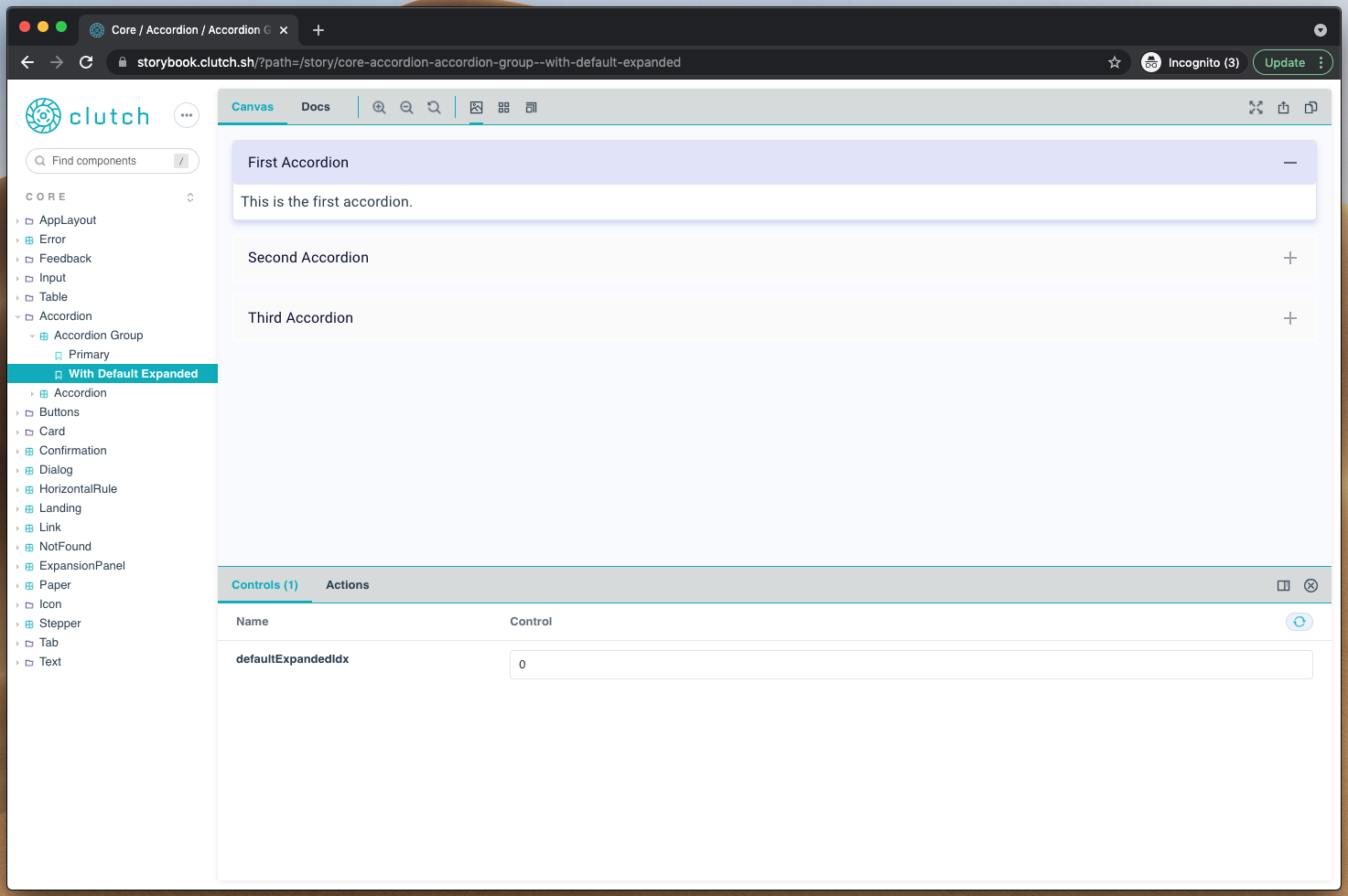
Simultaneously we worked to tackle the component isolation problem. Up until this point any changes to the existing components were tested within the Clutch app. New components would be added as needed and tested within the application. This was problematic since other factors, including sibling and parent components, could impact how the individual components rendered or functioned. Solving this problem now was especially important as we knew that implementing the new component designs would be much easier with a solution for this in place. We leveraged Storybook, which is designed specifically for this use case, to create the bones of what would become our current component library. For those who are unfamiliar with Storybook, it’s an open source tool that provides a component library and documentation site. It offers end users an easy interface to interact with components and modify their props by utilizing what they call stories. A story is a snippet of code that renders an individual component in a particular state. For example in the screenshot below you can see an accordion group story with one accordion expanded by default. Development and code reviews were now much easier, as each new or redesigned component was accompanied with a story demonstrating every variant of the component.
Decisions, Decisions...
Knowing we were about to begin tackling the large task of implementing the new component and workflow designs, we decided to revisit several pieces of the current Clutch frontend stack. It was crucial that we made the best decision up front as migrating later would be a much larger effort.
Component Library
As previously mentioned, Clutch originally shipped with Material UI as the component library, primarily out of necessity given our lack of dedicated design resources. When looking over the landscape we narrowed the choices for how to build out our new component library down to three options:
- Build our own components from scratch
- Utilize an existing Lyft internal component library and help them open source
- Continue to build custom components wrapping Material UI components under the hood
Each of these has its trade offs and ultimately we decided to go with the third option. Building out and maintaining our own components wasn’t feasible with the current size of the team and introducing a dependency on an external team to open source a Lyft component library had potential to put our timeline at risk. Building out custom components that wrapped Material’s components allowed us to inject custom styles where needed, control the interface for our components, and leverage the amazing work that so many others are actively putting into the project.
Styling Framework
Clutch launched with styled-components, a popular and performant styling framework that’s easy to use and has a large community behind it. However, an RFC published by the maintainers of Material UI, which outlined a proposal to remove the custom styling implementation that ships with the framework and instead leverage an existing external library, made us take another look. We settled on three possible options:
There were numerous pros and cons to each of these solutions but emotion ended up being the right fit for us, especially considering our choice to use Material UI and their decision to migrate onto emotion in v5.
Now that the tough decisions were out of the way, we were able to start implementation of the new designs. It took three engineers from our team just over two months to finish redesigning the Clutch frontend. Thus far the response has been overwhelmingly positive. The expanded component library has made development of new workflows faster and our maintenance has been reduced drastically.

Iteration is Key
Design is ever-changing. While we feel that we have a great foundation, we are still finding ways to improve different pieces of the design throughout Clutch, both in the frontend and backend. (Stay posted for an upcoming blog on how we revamped error handling!) We continue to invest resources in ensuring that new features and workflows deliver the intuitive and exceptional experience users have come to expect.

Interested in Getting Involved?
The Clutch community is growing and we would love for you to be a part of it. Below are some resources to help you get started running clutch or contributing.